To add a WinForms Button to your application, you need to drag a new instance of the vButton Control from the Visual Studio Toolbox and drop it into your winforms application’s form. Some of the frequently used properties such as TextAlign, ImageAlign and TextImageRelation allow you to easily change the layout of the Button’s Text and Image. The VIBlend Button Control comes with 25 built-in Themes.
It supports the new Metro Blue, Green and Orange themes and the popular Office Themes including the themes from Microsoft Office 2003, Office 2007 and Office 2010. You can easily change the winforms button theme. What you need to do is to just set the VIBlendTheme property and the winforms button will automatically change its visual appearance.
Sometimes users want to customize a theme settings such as backcolor or forecolor. In this post, we will create a custom Theme using the VIBlend Controls APIs and will apply it to the WinForms Button control.
- Define the theme colors. The colors array defines the default state colors, the highlight colors array define the colors used when the mouse is over the button. The pressed colors array defines colors used when the winforms button is pressed.
**C#**
Color[] colors = new Color[]{ Color.FromArgb(255,39,94,176), Color.FromArgb(255, 37, 92, 175), Color.FromArgb(255,51,105,206), Color.FromArgb(255,53,135,226)};
Color[] highlightColors = new Color[]{Color.FromArgb(255,59,114,196), Color.FromArgb(255, 57, 112, 185), Color.FromArgb(255,71,125,226), Color.FromArgb(255,73,155,246)};
Color[] pressedColors = new Color[]{Color.FromArgb(255,79,134,216), Color.FromArgb(255, 77, 132, 215), Color.FromArgb(255,91,145,246), Color.FromArgb(255,93,175,255)};
VB .NET
Dim colors() As Color = {Color.FromArgb(255,39,94,176), Color.FromArgb(255, 37, 92, 175), Color.FromArgb(255,51,105,206), Color.FromArgb(255,53,135,226)}
Dim highlightColors() As Color = {Color.FromArgb(255,59,114,196), Color.FromArgb(255, 57, 112, 185), Color.FromArgb(255,71,125,226), Color.FromArgb(255,73,155,246)}
Dim pressedColors() As Color = {Color.FromArgb(255,79,134,216), Color.FromArgb(255, 77, 132, 215), Color.FromArgb(255,91,145,246), Color.FromArgb(255,93,175,255)}
- Define the default, highlight and pressed states. The following code illustrates how to create the styles for the winforms button states. The 90 number is for the gradient angle. This means that the button’s gradient will be vertical. The 0.7f and 0.9f define the offset between each gradient color starting from 0 to 1. You can think about this as: 0f – first color, 0.7f – second color, 0.9f third color and 1.0f fourth gradient color.
C#
FillStyleGradientEx normalStyle = new FillStyleGradientEx (colors[0], colors[1], colors[2], colors[3], 90, 0.7f, 0.9f);
FillStyleGradientEx highlightStyle = new FillStyleGradientEx(highlightColors[0], highlightColors[1],highlightColors[2], highlightColors[3], 90, 0.7f, 0.9f);
FillStyleGradientEx pressedStyle = new FillStyleGradientEx(pressedColors[0], pressedColors[1],pressedColors[2], pressedColors[3], 90, 0.7f, 0.9f);
Color borderColor = Color.FromArgb(31, 72, 161);
Dim normalStyle As New FillStyleGradientEx(colors(0), colors(1), colors(2), colors(3), 90, 0.7f, 0.9f)
Dim highlightStyle As New FillStyleGradientEx(highlightColors(0), highlightColors(1), highlightColors(2), highlightColors(3), 90, 0.7f, 0.9f)
Dim pressedStyle As New FillStyleGradientEx(pressedColors(0), pressedColors(1), pressedColors(2), pressedColors(3), 90, 0.7f, 0.9f)
Dim borderColor As Color = Color.FromArgb(31, 72, 161)
- Create a ControlTheme instance and initialize its StyleNormal, StyleHighlight and StylePressedproperties. The FillStyle member defines the background, BorderColor defines the border’s color and TextColor defines the displayed text’s color.
C#
ControlTheme theme = ControlTheme.GetDefaultTheme(VIBLEND_THEME.OFFICEBLUE).CreateCopy();
theme.StyleNormal.FillStyle = normalStyle;
theme.StyleNormal.BorderColor = borderColor;
theme.StyleNormal.TextColor = Color.White;
theme.StyleHighlight.FillStyle = highlightStyle;
theme.StyleHighlight.BorderColor = borderColor;
theme.StyleHighlight.TextColor = Color.White;
theme.StylePressed.FillStyle = pressedStyle;
theme.StylePressed.BorderColor = borderColor;
theme.StylePressed.TextColor = Color.White;
Dim theme As ControlTheme = ControlTheme.GetDefaultTheme(VIBLEND_THEME.OFFICEBLUE).CreateCopy()
theme.StyleNormal.FillStyle = normalStyle
theme.StyleNormal.BorderColor = borderColor
theme.StyleNormal.TextColor = Color.White
theme.StyleHighlight.FillStyle = highlightStyle
theme.StyleHighlight.BorderColor = borderColor
theme.StyleHighlight.TextColor = Color.White
theme.StylePressed.FillStyle = pressedStyle
theme.StylePressed.BorderColor = borderColor
theme.StylePressed.TextColor = Color.White
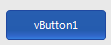
- The final step is to set the button’s Theme property to point to the ControlTheme instance.
C#
this.vButton1.StyleKey = "ButtonNewStyle";
this.vButton1.Theme = theme;
Me.vButton1.StyleKey = "ButtonNewStyle"
Me.vButton1.Theme = theme
NOTE: This is a Wiki Post feel free to edit it and add more details or correct it.