isoftech
August 29, 2016, 5:58pm
#1
Hi,
I have 3 Bootstrap div columns, within a parent div, these columns are of the same width but I need them to be of the same height as well.
here is part of my html code:
<div class="row">
  <div class="container">
    <div class="col-md-4">
       1st column
    </div>
    <div class="col-md-4">
        2nd column
    </div>
    <div class="col-md-4">
        3rd column
    </div>
  </div>
</div>
3 Likes
afree
August 30, 2016, 1:32am
#2
I believe @isoftech you can get that behavior by using the .row-eq-height bootstrap css class, you can apply that class to your parent row like this:
 <div class="row row-eq-height">
  <div class="container">
    <div class="col-md-4">
       1st column
    </div>
    <div class="col-md-4">
        2nd column
    </div>
    <div class="col-md-4">
        3rd column
    </div>
  </div>
</div>
You might need to add the equal-height-columns.css file to your web page heading as well, before using that class.
<link rel="stylesheet" href="http://getbootstrap.com.vn/examples/equal-height-columns/equal-height-columns.css />
4 Likes
isoftech
August 31, 2016, 1:44am
#3
Thank you @afree , that’s exactly what I was looking for!
Yassine
August 31, 2016, 7:37am
#4
I would suggest that you actually change columns style yourself, and set display: table-cell
Something like this should do the trick:
.row {
  display: table;
}

[class*="col-"] {
  float: none;
  display: table-cell;
  vertical-align: top;
}
That should change the style for every element implementing a class prefixed “col-” so no need to change your already existing html.
1 Like
jms
May 21, 2017, 4:23am
#5
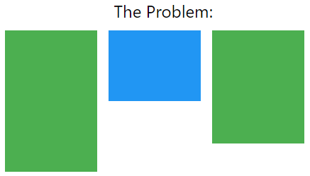
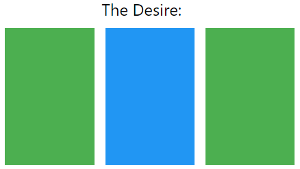
As far as I understand, this is your problem:
And this is your desired effect:
You can get that desired effect using some CSS, Let us first implement some dummy HTML <div /> blocks:
<div class="row">
  <div class="columns-parent">
    <div class="my-column">
       1st column
    </div>
    <div class="my-column">
        2nd column
    </div>
    <div class="my-column">
        3rd column
    </div>
  </div>
</div>
Then, we can implement the columns-parent and my-column classes in CSS, It should be something like this:
.columns-parent {
    display: table;
    width: 100%;
}

.my-column {
    display: table-cell;
}
As opposite to what everyone else did before me. I am using this table display trick (display: table;). And I’m making every child column behave like a table-cell. And it works really perfect
1 Like


